Read Ritual
Read Ritual is a habit-forming app designed to help users develop and maintain a consistent reading routine. It offers personalized reminders, progress tracking, and motivational rewards to make reading engaging and rewarding. This project, developed as part of my UX case study at Thomas Jefferson University, aims to create a seamless and inspiring experience for readers.
Duration
12 Weeks
Timeline
Aug 24 - Dec 24
Role
UX Designer
Project
Academic
What I did
Storyboarding, Ideation, Wire-framing, User flow, Usability Testing, Research Synthesis, User Interviews, Prototyping
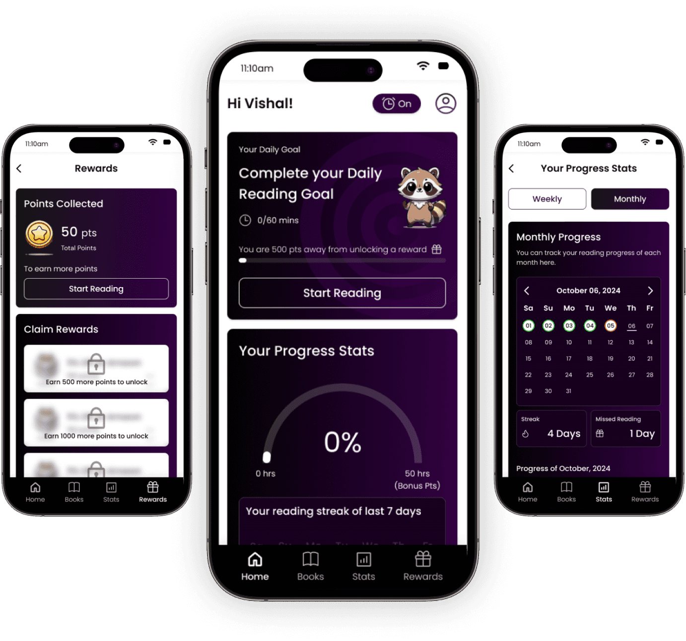
About Read Ritual
Read Ritual is a thoughtfully designed app to help users build and maintain a consistent reading habit or enhance their reading skills. The app provides personalized reminders to keep you on schedule, tracks your progress to highlight your achievements, and includes motivating features to keep you engaged. Additionally, Read Ritual rewards you for meeting your reading goals, making the process enjoyable and rewarding. Whether you’re starting your reading journey or looking to improve, Read Ritual is your companion for cultivating a fulfilling reading routine.
Read Ritual
© 2024 Designed By Vishal Thakkar

Design Outcomes
Intuitive Onboarding Process
The onboarding process for Read Ritual consists of six steps: entering the user’s name, selecting reading time, choosing genres, receiving book recommendations, adding book details, and setting reminders. These steps are designed to help users set reading goals and ensure the app effectively tracks progress. By the end, users are ready to build and maintain a consistent reading habit. A detailed walkthrough is available in the video.
Read Ritual application Features
The MVP of the Read Ritual app focuses on three core features, as shown in the video. These include:
Adding Books: Users can input details of physical books they are reading to track their progress.
Statistics: This feature monitors the user’s reading progress, providing insights and milestones.
Rewards: Users earn points for consistent reading, which can be redeemed for rewards, adding motivation to maintain their habit.
These essential features were selected to ensure the MVP is functional, engaging, and ready for further iterations
Process of Trigger to Rewards
The Action phase of the Hook Model begins with a trigger, prompting the user to start reading their book and record their progress. The video demonstrates how the user moves seamlessly through the Hook Model phases—from trigger to action, followed by reward and investment—creating an engaging and habit-forming experience.
Design Process
To develop the product, I utilized the five planes of design outlined in book The Elements of User Experience. The process incorporated four key elements of habit-forming design, inspired by principles from the Hooked model.
The project was structured into five stages aligned with the five planes, ensuring a comprehensive approach to product development. After building the prototype, I conducted usability testing and rapid validation experiments to evaluate and enhance the product's effectiveness.


Strategy
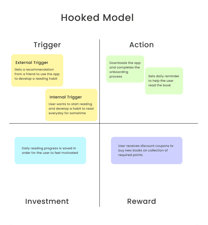
Secondary Research and adapting Hooked Model strategies
My initial step was to thoroughly explore how to build an application designed to cultivate a reading habit. To achieve this, I applied the principles of the Hooked model, analyzing how to incorporate features that establish triggers, drive actions, provide rewards, and encourage user investment. This exercise helped shape the app's design to effectively engage users and foster consistent reading habits.
Storyboard
I created a storyboard to visualize how users would interact with the application and to demonstrate how the Hookedmodel would function in real-world scenarios. The storyboard mapped out key moments in the user journey, showcasing how triggers would prompt actions, how rewards would reinforce engagement, and how investments would encourage continued use, ultimately building a strong reading habit.
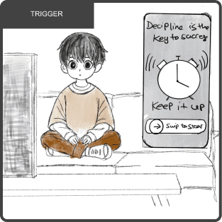
Nick receives a reminder to read the book
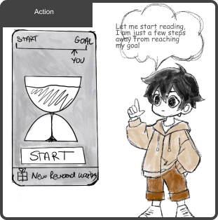
Nick starts the timer and begins to read.
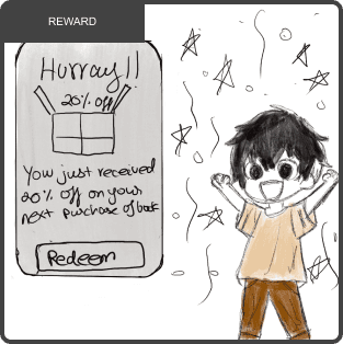
He receives a reward on completion of task
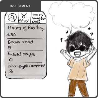
He is happy with the progress that he has made
Scope
MoSCoW Analysis
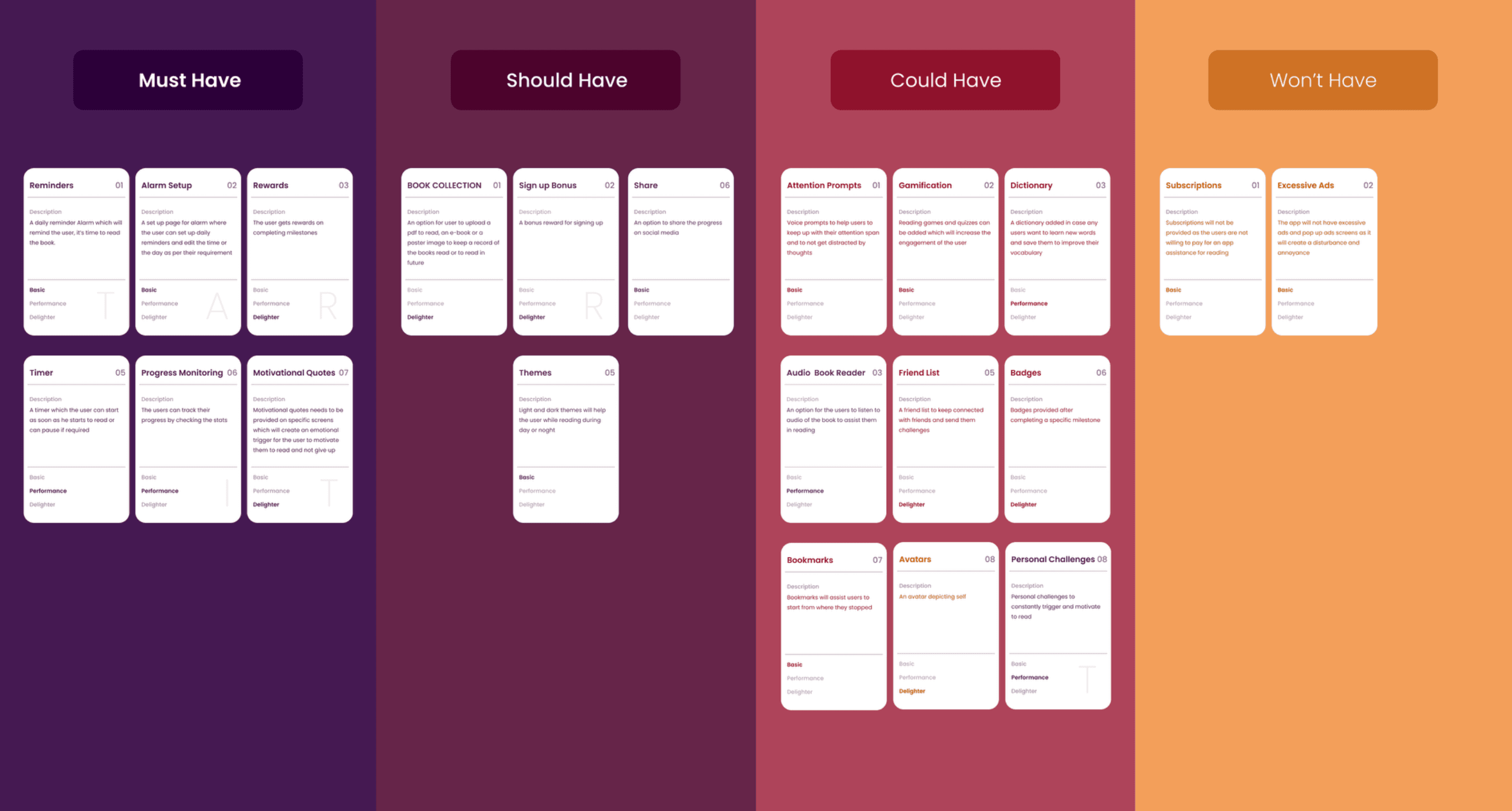
To prioritize features for the MVP, I conducted a MoSCoW analysis. This method allowed me to categorize features into Must-Haves and Should-Haves for immediate inclusion in the design, ensuring the core functionality was addressed. Features classified as Could-Haves were set aside for future iterations, while Won’t-Haves were discarded to maintain focus and streamline development. This process ensured that the MVP remained both efficient and impactful.
Structure
User Flow
The next step was to create a user flow to visualize how the application functions. This helped map the user journey, identify friction points, and refine interactions for a seamless and engaging experience.

Skeleton
Wireframe
The next step in the UX process was creating sketches of wireframes. This phase allowed me to consolidate ideas into a preliminary model, providing a clearer vision of how the application would look and function. The primary goal was to ensure the features were cohesive and well-aligned, laying the groundwork for transitioning to high-fidelity designs.

Style Guide
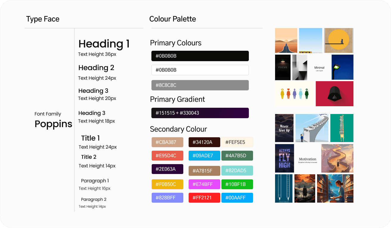
The next step in the design process was developing a mood board and style guide. This phase was crucial for establishing the visual identity of the product. The mood board helped define the overall aesthetic, tone, and emotional appeal, while the style guide ensured consistency in colors, typography, and design elements across the application. Together, these tools laid a strong foundation for creating a cohesive and visually engaging user experience.
Skeleton
Usability Test Plan
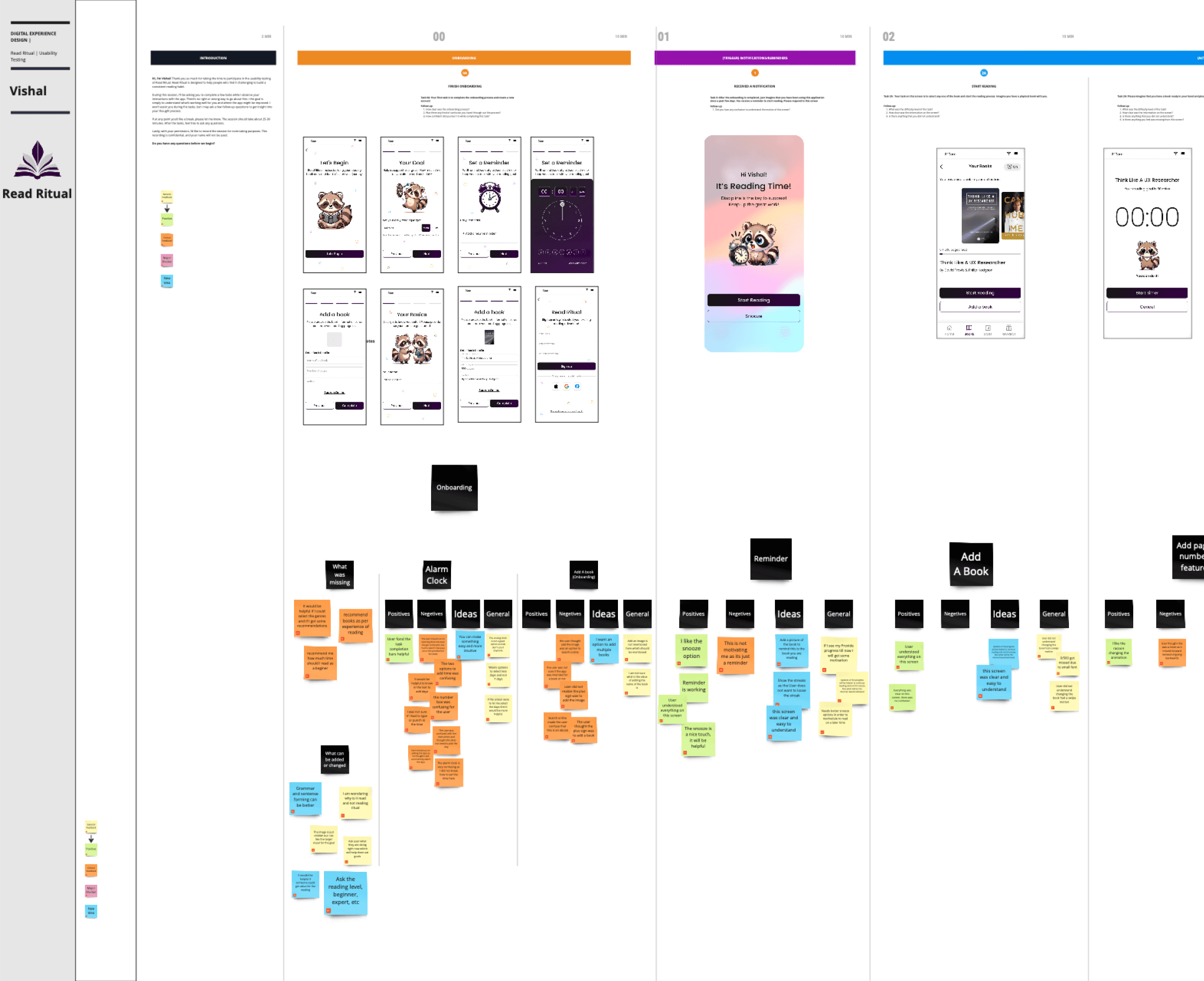
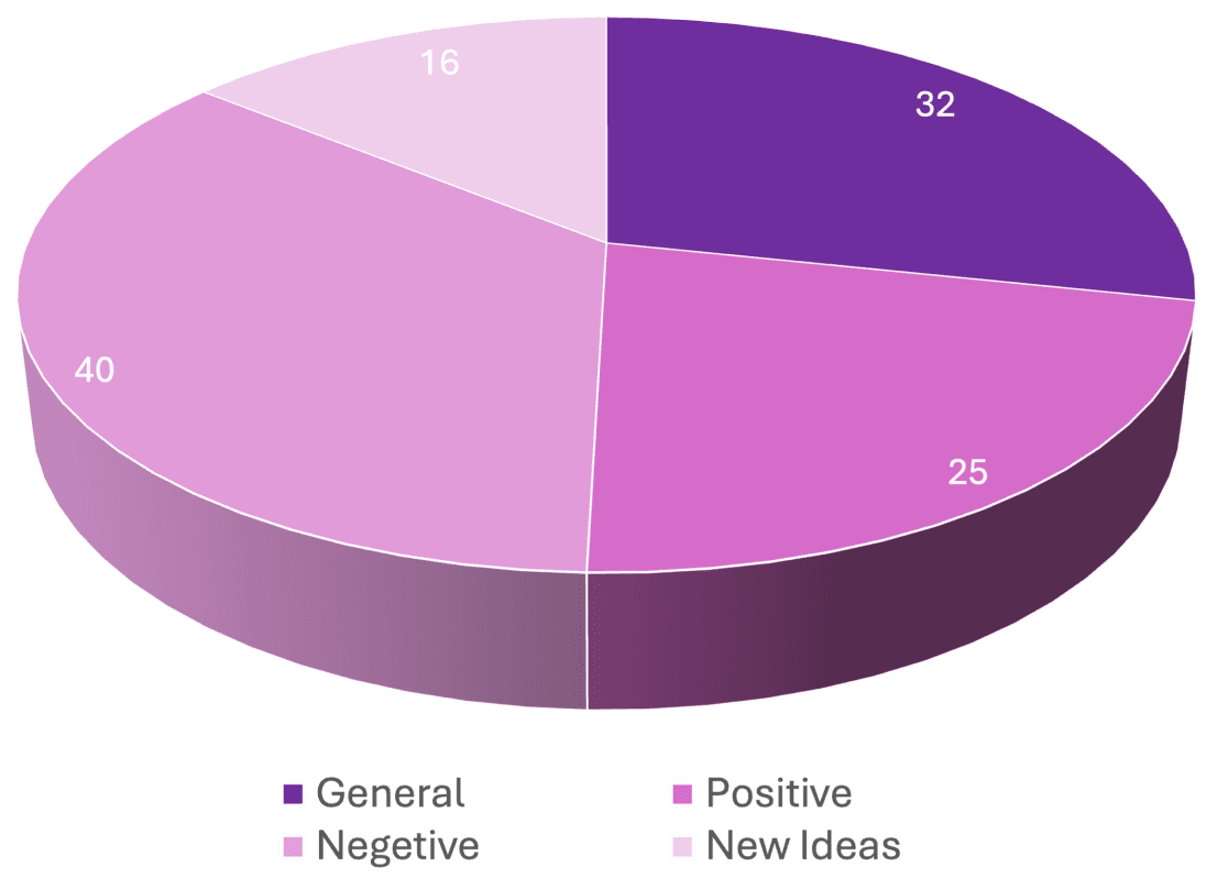
After completing the usability testing, feedback from the five user interviews was synthesized into four categories: Positives, Negatives, Ideas, and General Comments. This process helped identify the key issues users faced with the design and assess which ones had the greatest impact, providing a clear direction for developing effective solutions.
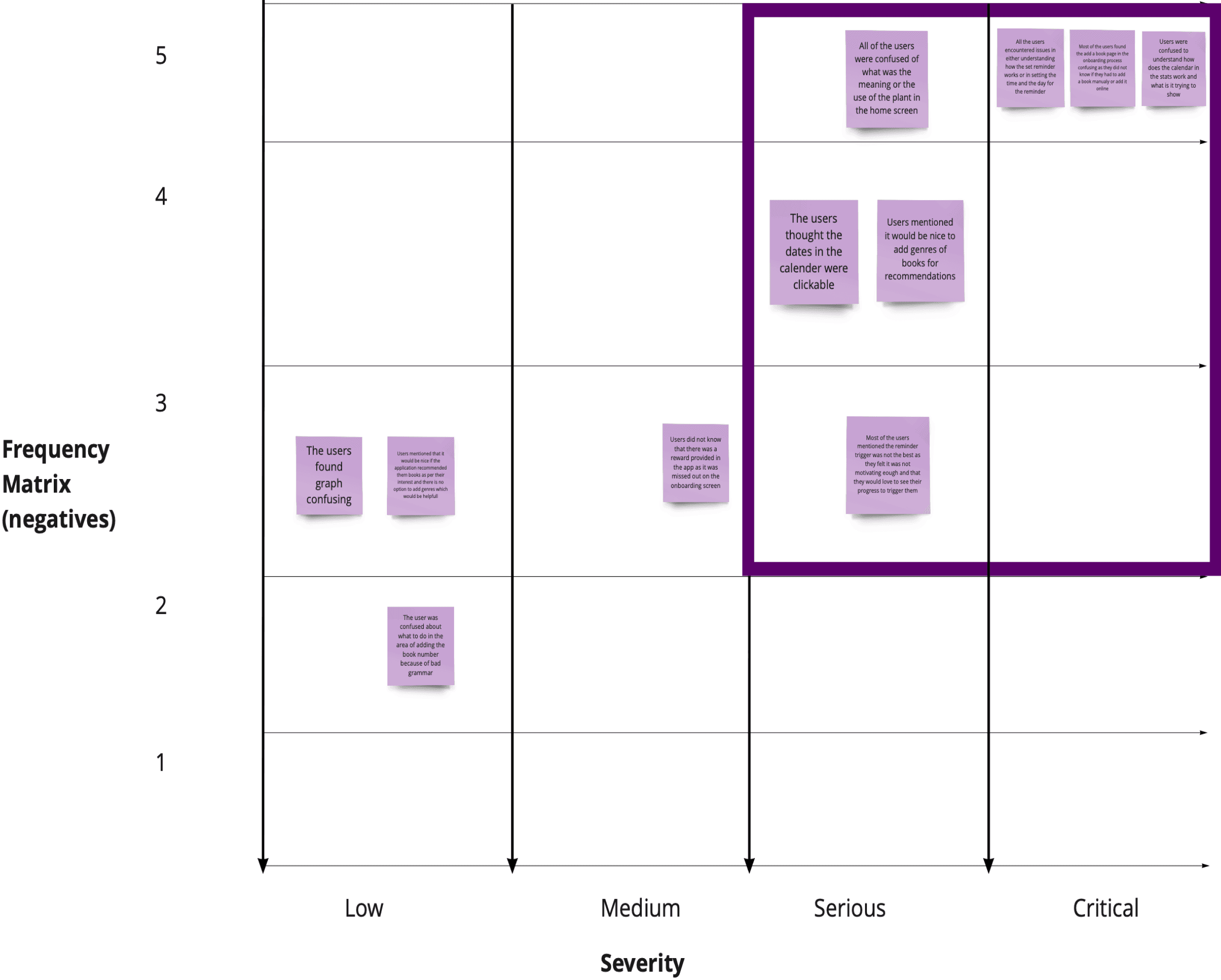
Usability Testing Summary
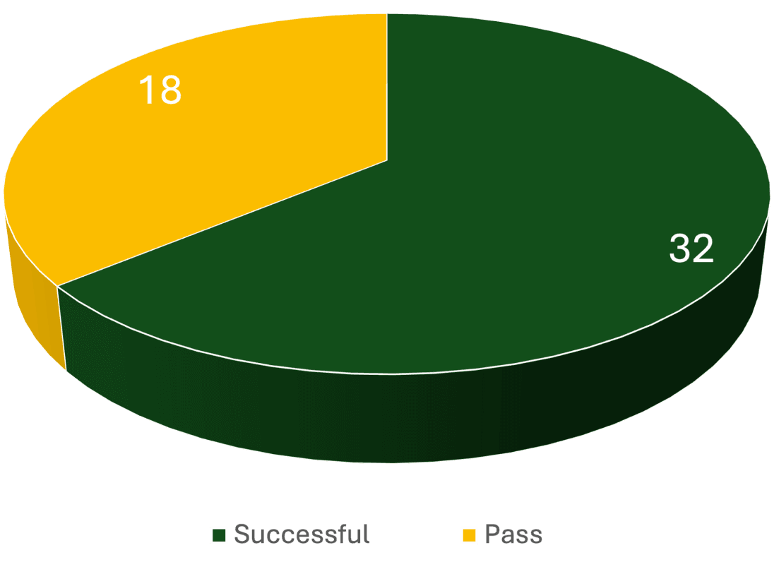
The usability testing was overall successful and provided valuable insights into how users interacted with the product. It highlighted areas where users faced challenges, as well as features that performed well. While participants were able to complete all assigned tasks, some friction points were identified during the sessions. These areas will be further analyzed to enhance the user experience and address any usability concerns.
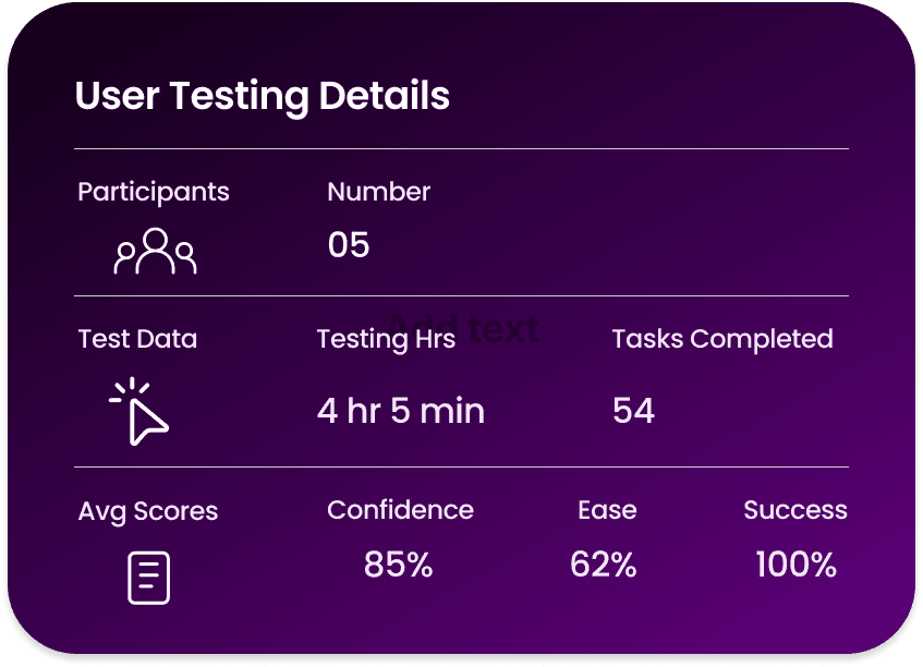
User Feedback

Percentage of Successful Tasks

Task Findings and Analysis
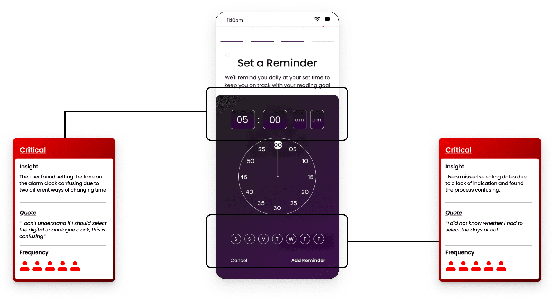
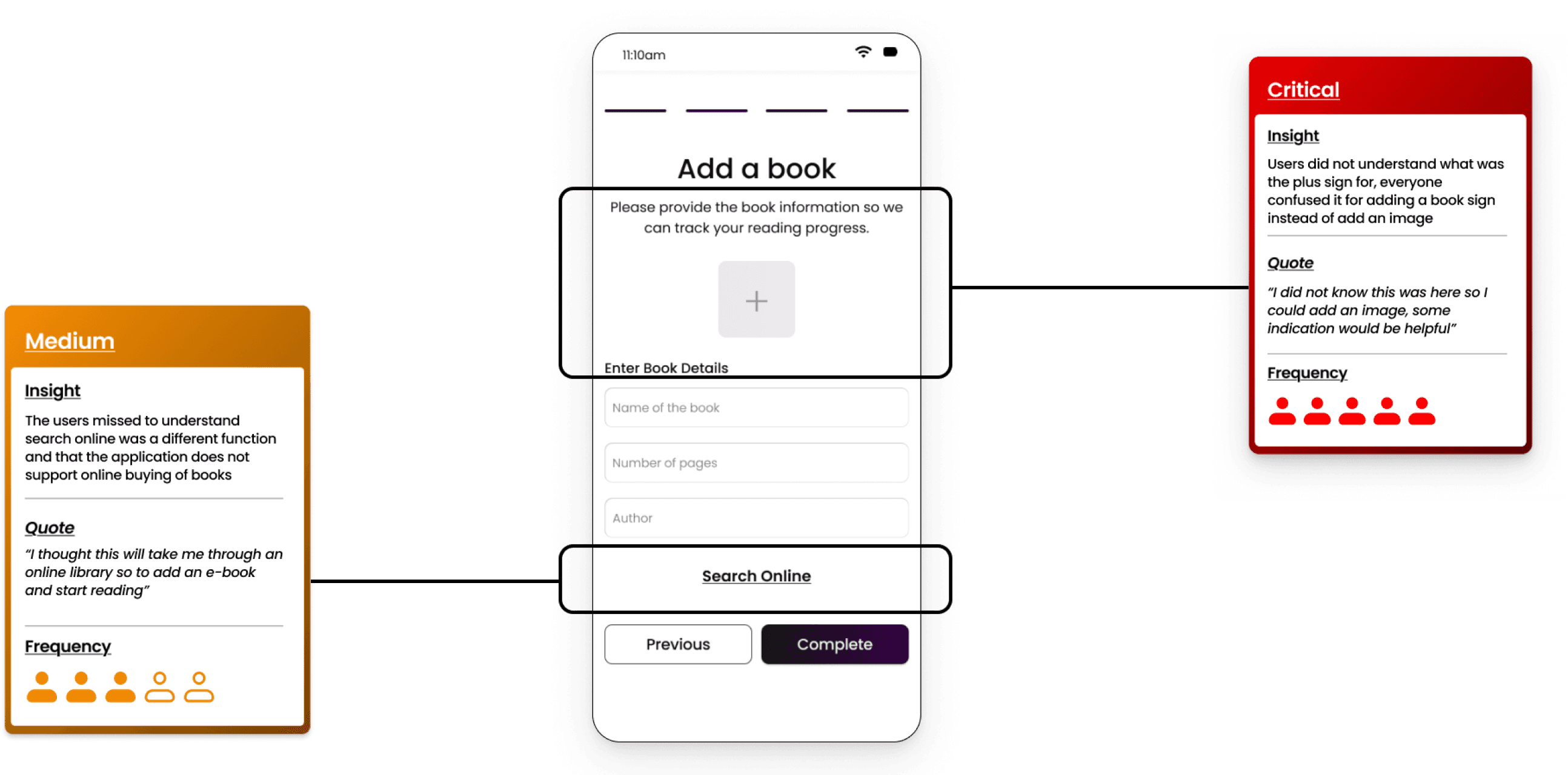
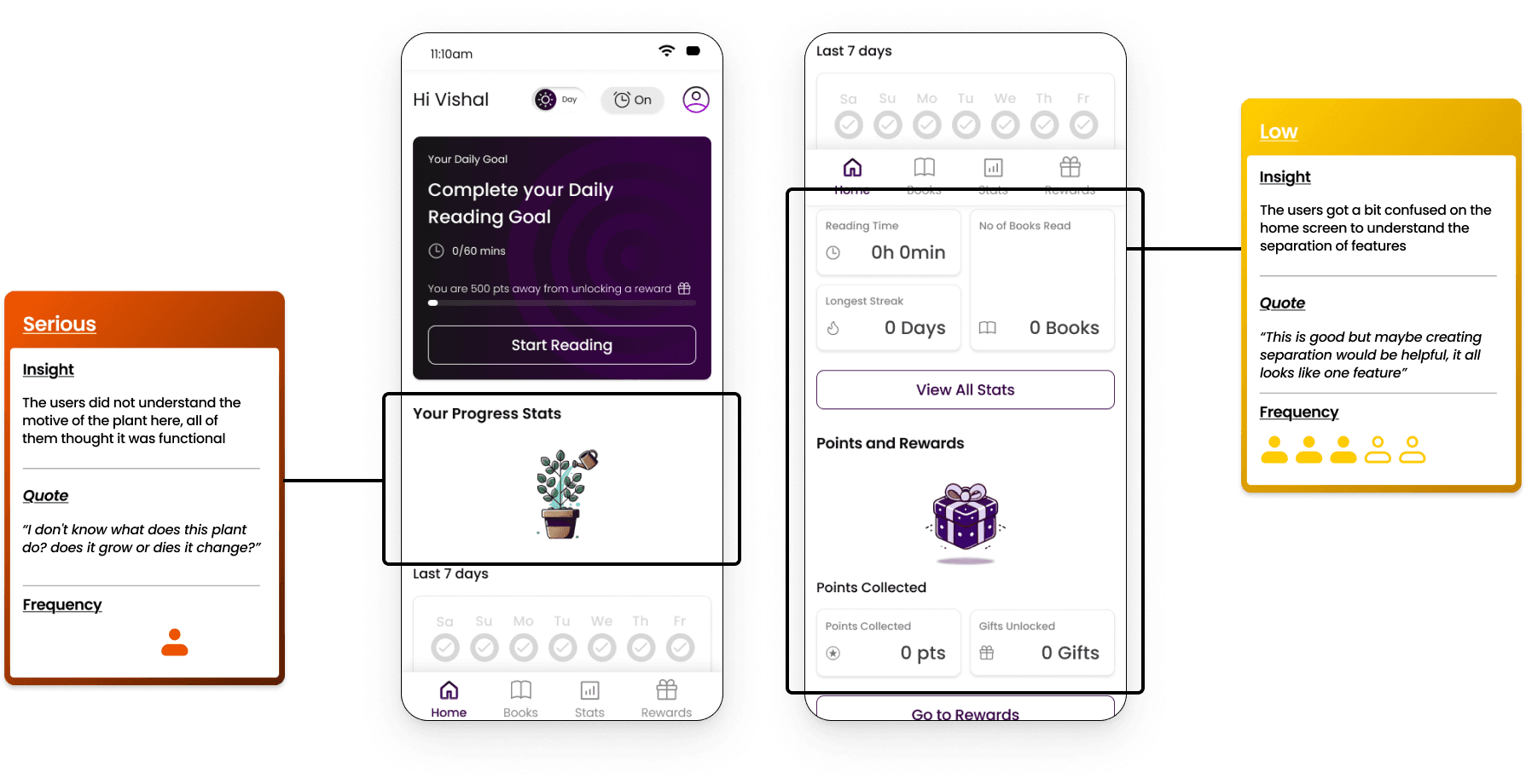
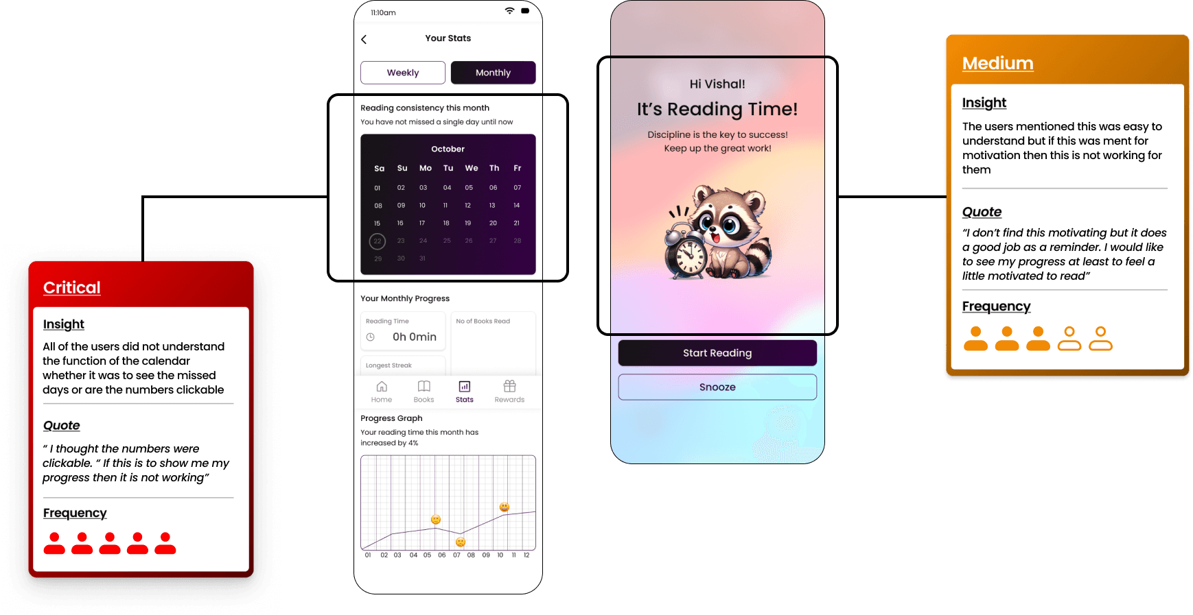
Recommended Solutions
Using the SCAMPER model, I began developing design solutions for all the screens and features that users found challenging to understand or use, as identified during the user interviews.
View all solutions
Set a Reminder (S C A M P E R - Modify)
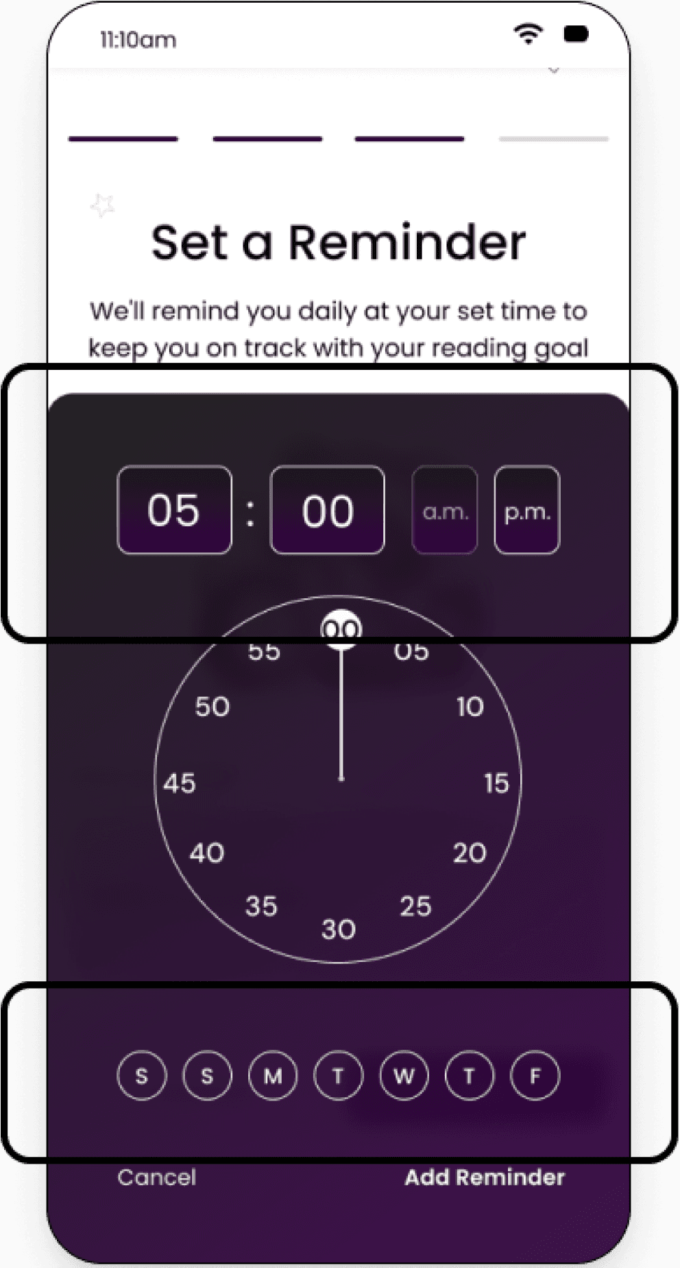
Before
Modify
In the original design, users found setting the time confusing. Most attempted to use the digital boxes, while others struggled to understand the analog feature due to a lack of instructions. Additionally, all users missed selecting the days because the function lacked a clear title.
To address these issues and improve usability, I revised the design to include only the digital method for setting the time, accompanied by clear instructions. For the day selection, I added a title and explanation to ensure users could easily identify and complete this step without oversight. These changes streamlined the process and reduced friction in task completion.
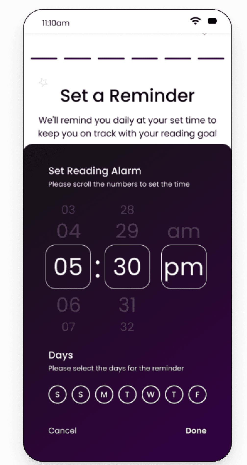
After
Set a Reminder (S C A M P E R - Modify)
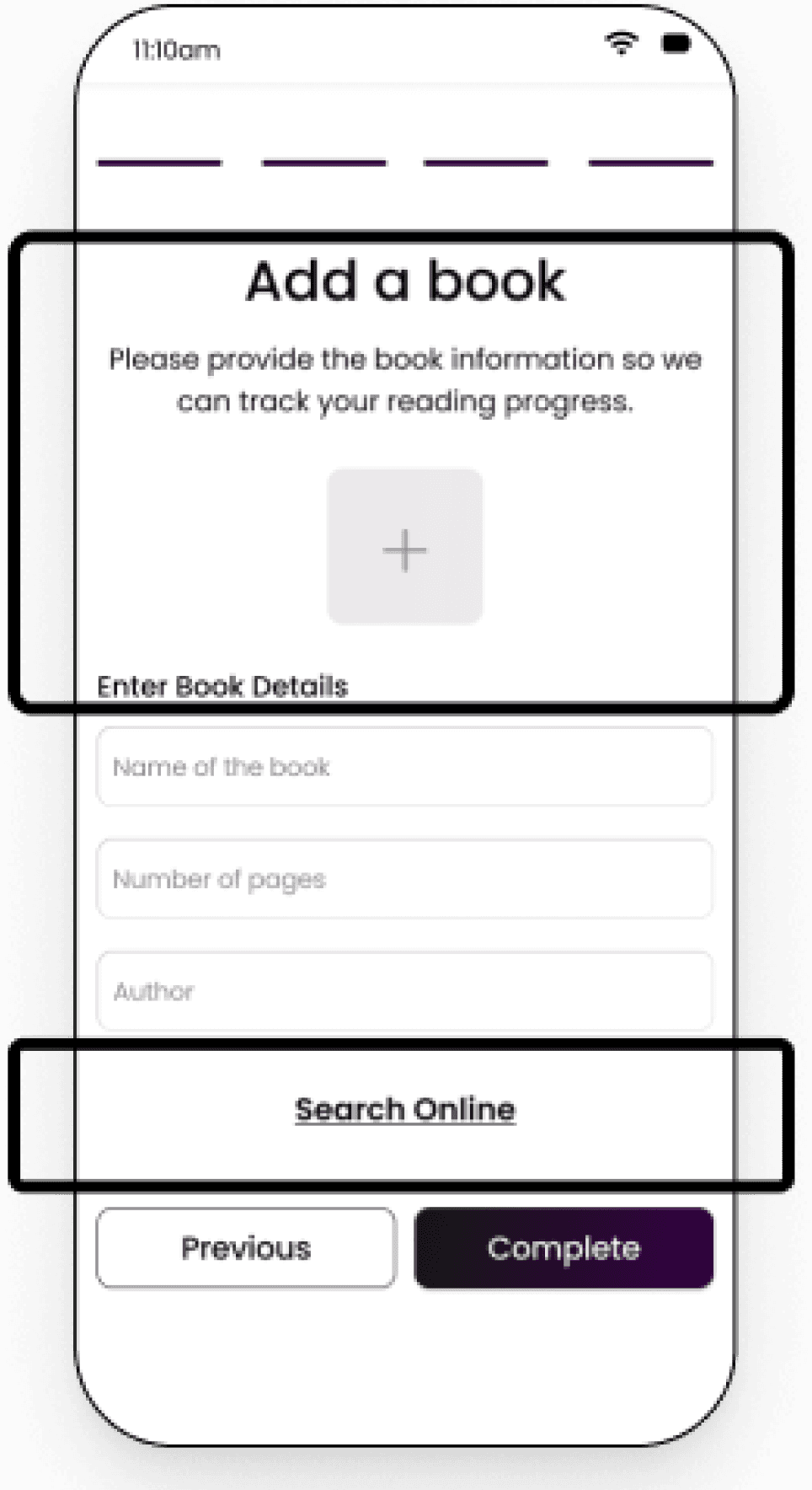
Before
Modify
In the original design, the header "Add a Book" confused users, leading them to believe they could find or add an e-book, which was misleading. Additionally, the purpose of the page—to add book details for progress tracking—was unclear. Users were unaware that there was no option to buy or add an e-book.
To resolve this, I updated the header to "Add Your Book" and included a note clarifying that users should only add details of the book they are reading or search online to find and input the book's details. These changes reduced confusion and aligned the design with the intended purpose.
Eleminate
The plus sign for adding an image was removed as users found it unclear. Since book details and images could be retrieved online, the feature was unnecessary.
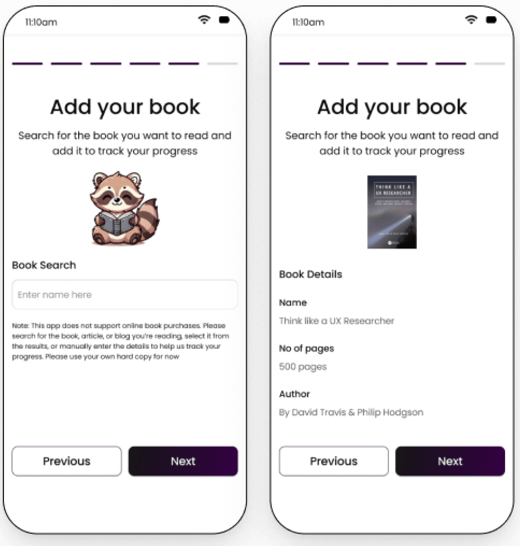
After
Next Steps
Usability testing revealed that while users found the application enjoyable and helpful, they expressed concerns about its ability to keep them engaged long-term without the addition of more interactive features. Many users also raised the issue of potential cheating to earn rewards, highlighting a need for measures to ensure fairness and maintain user trust.
Develop a community feature which will make it possible for the users to interact with each other and make the application more social where the users can come together and share their learnings from the same books they have read
Add a Quiz feature so that the users do not cheat by just entering the page number instead of reading
Other Projects
Academic Project
B2C
E-commerce
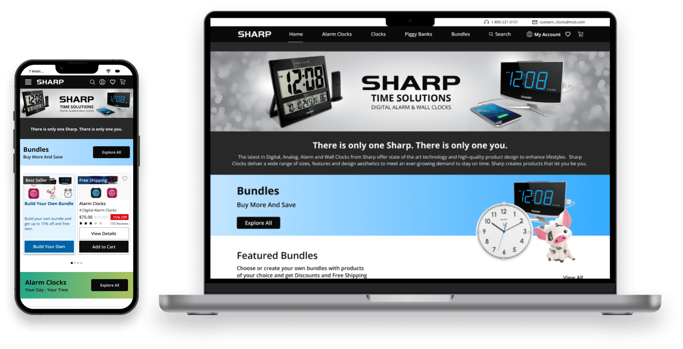
Sharp website redesign
Redesign of Sharp website by integrating e-commerce platforms, SAAS solutions and an innovation for better user experience
Academic Project
Research

Gen-Ai for academic research
Research shows AI boosts pharmacy research. Universities should integrate AI into curricula and programs.